Project Overview
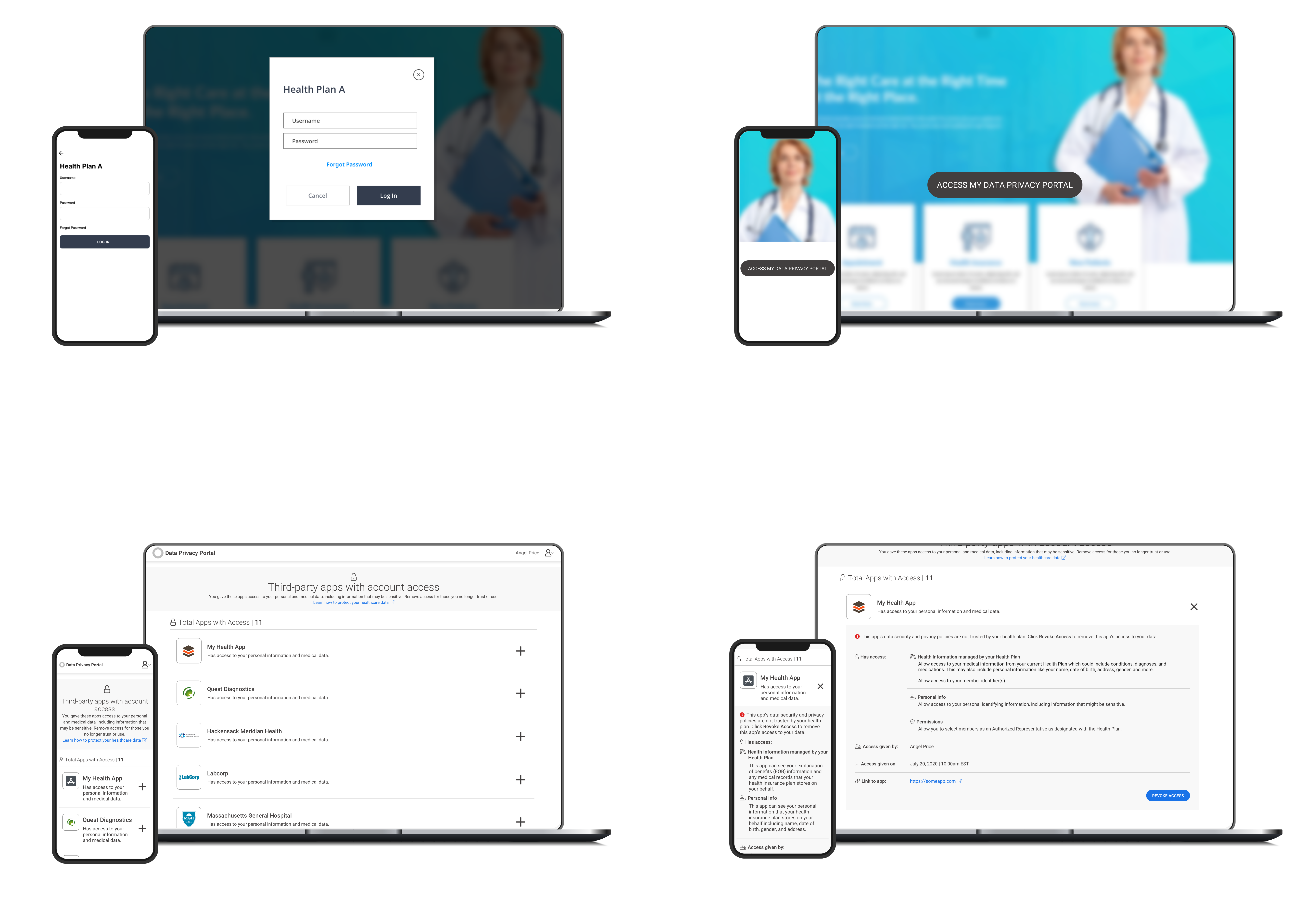
Health plans can ingest data from CMS and integrate it with other data sources.Generate new insights to help consumers make better, personalized health choices and enable providers to make informed decisions with more data.
My Contributions
528 hours! 3 Project managers, 3 UX, 10 Developers, Thanks to my UX manager who believed in me and gave me freedom to make any UX/Design decisions.

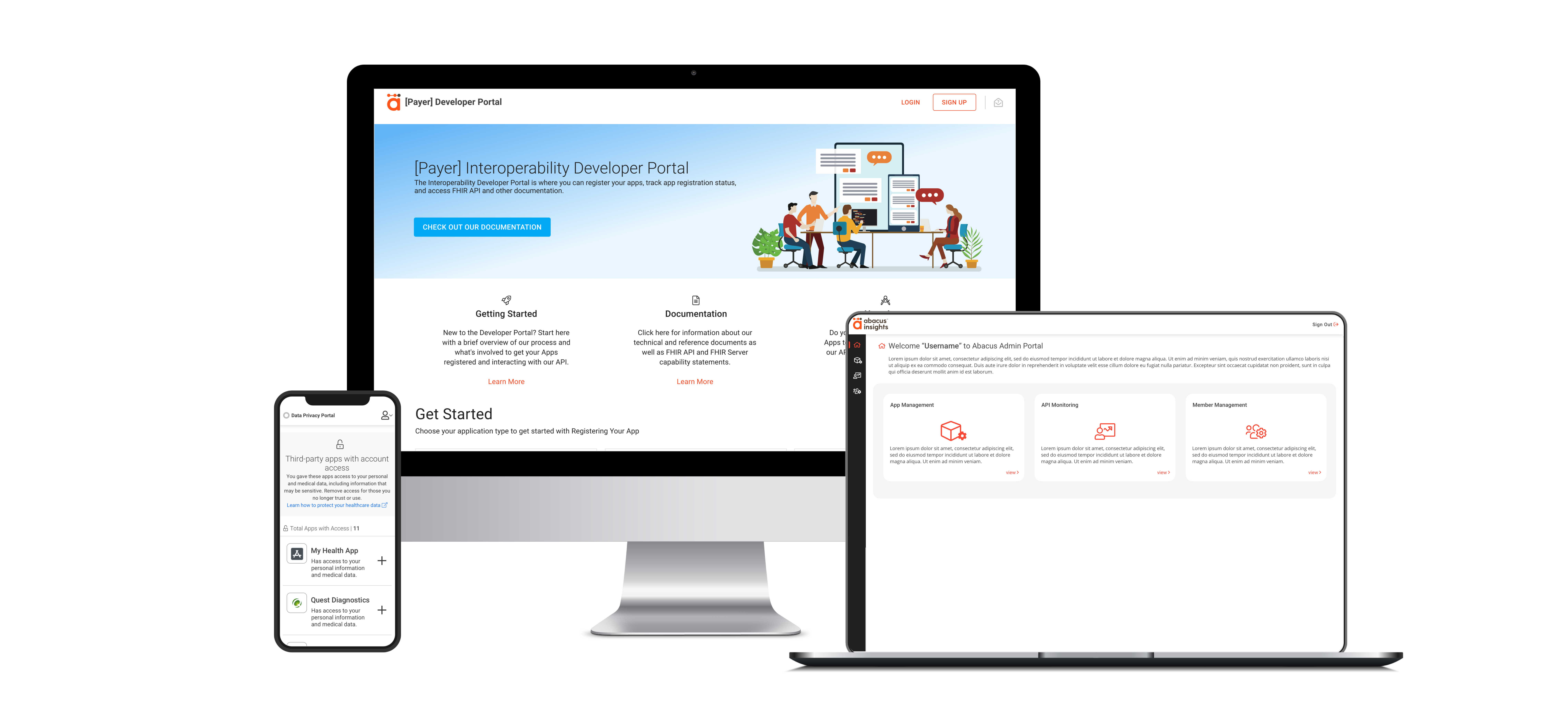
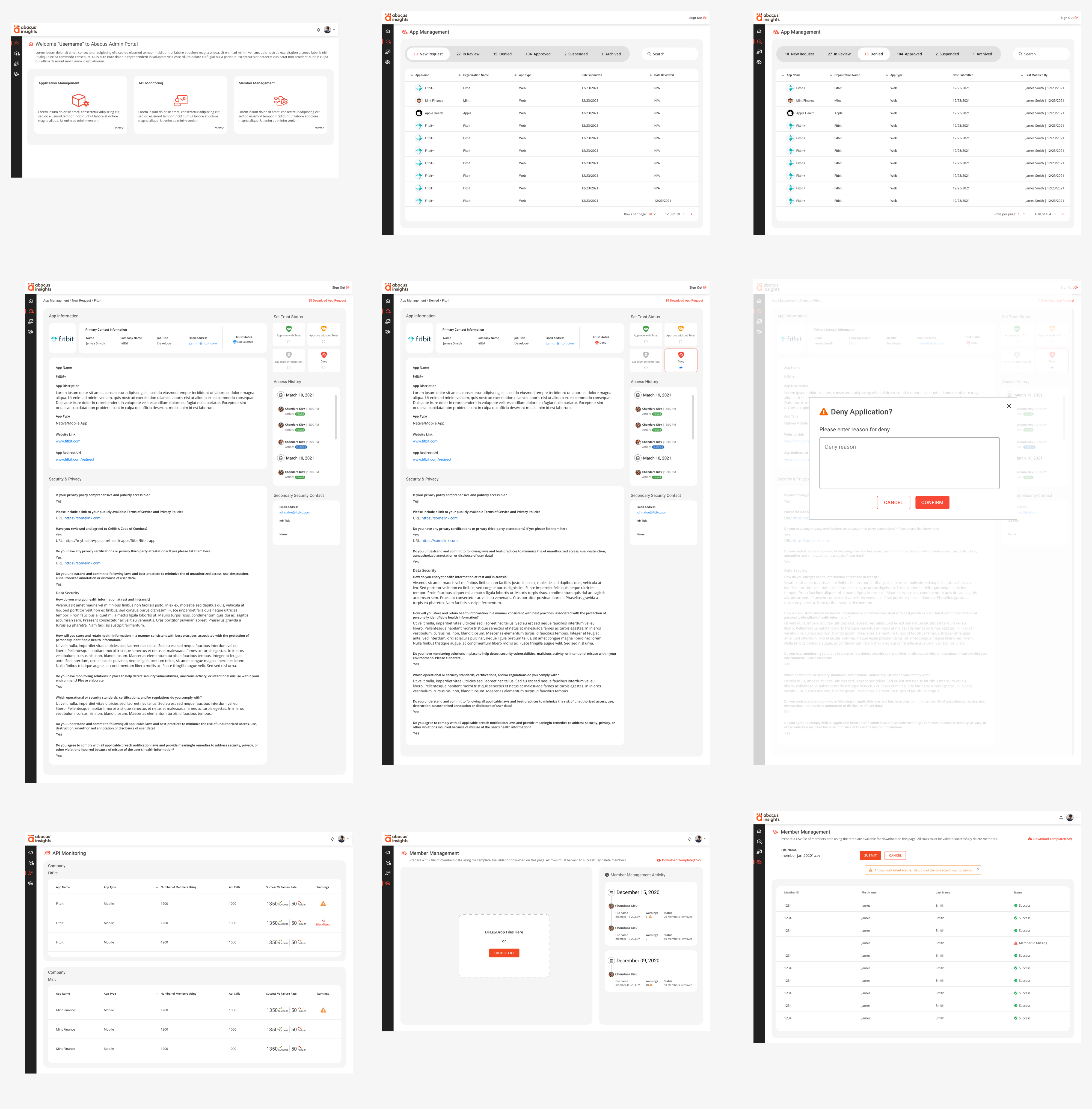
When I heard the term CMS for first time, as a IT person I thought of Content management system, but when I did my research starting from who, what and why. I found the term is use for Centers for Medicare & Medicaid Services which give patients better access to their health information. For this project we build 3 portals - Payer Members, Developer Portal & Payers Admin Portal.

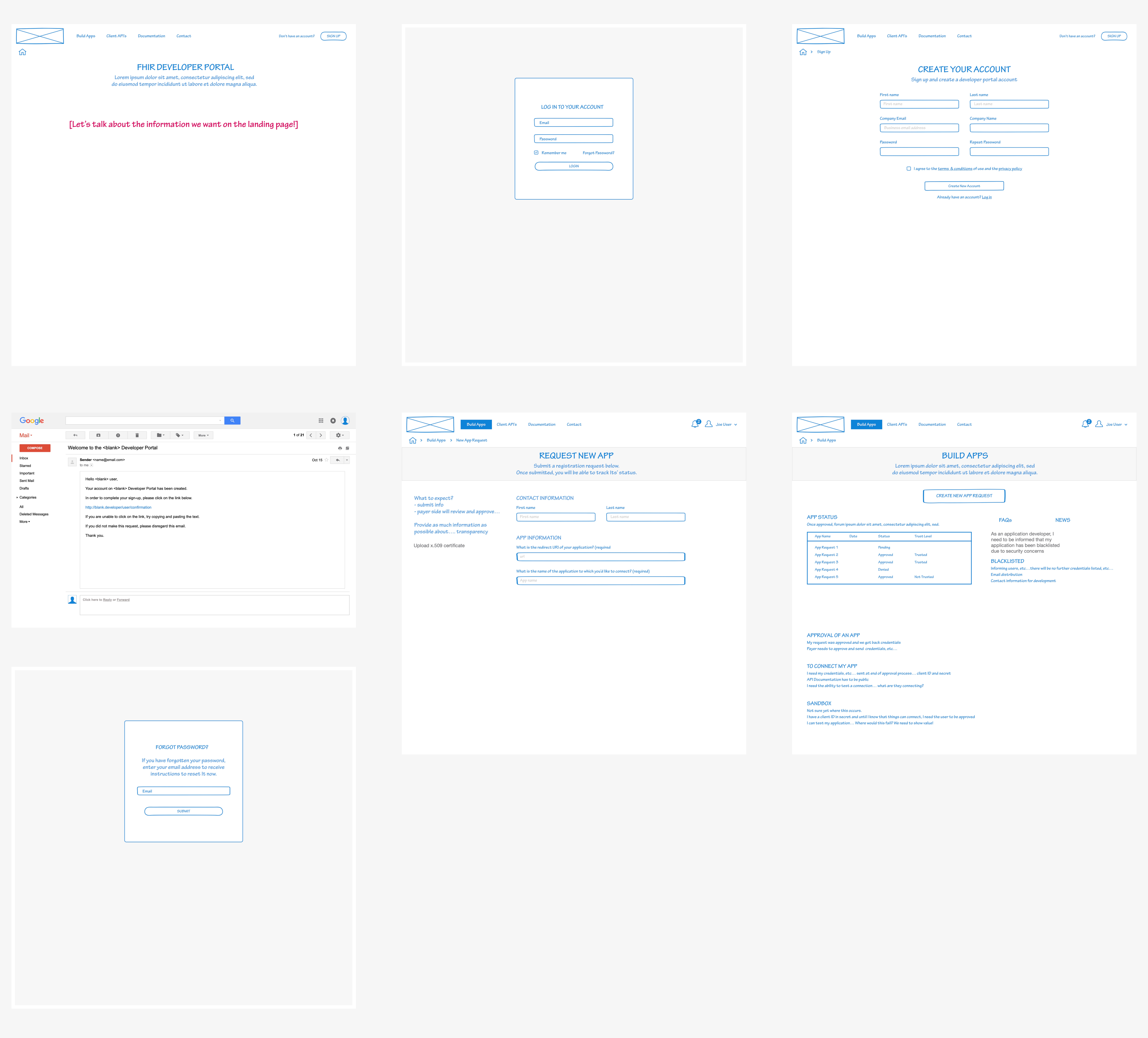
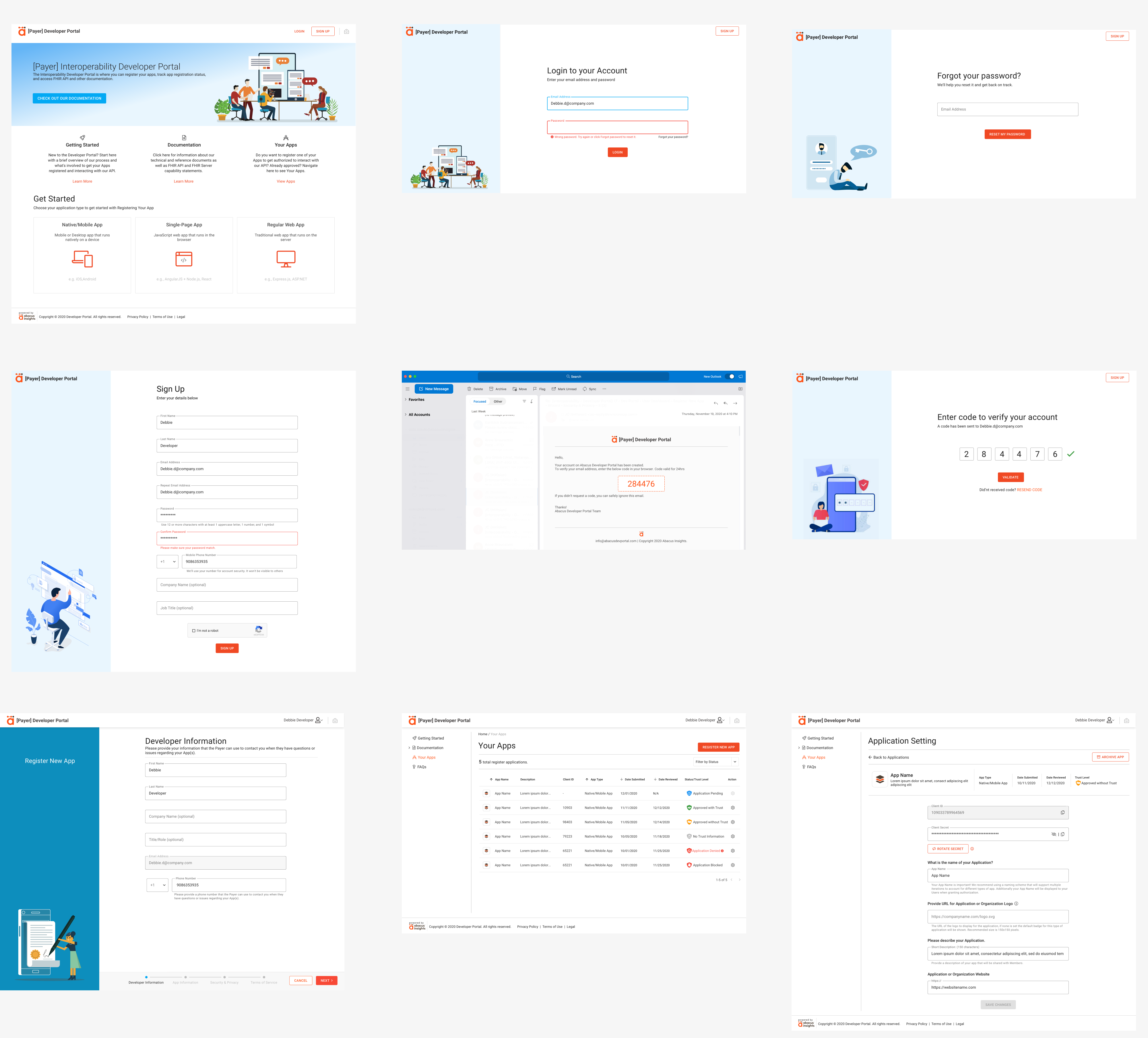
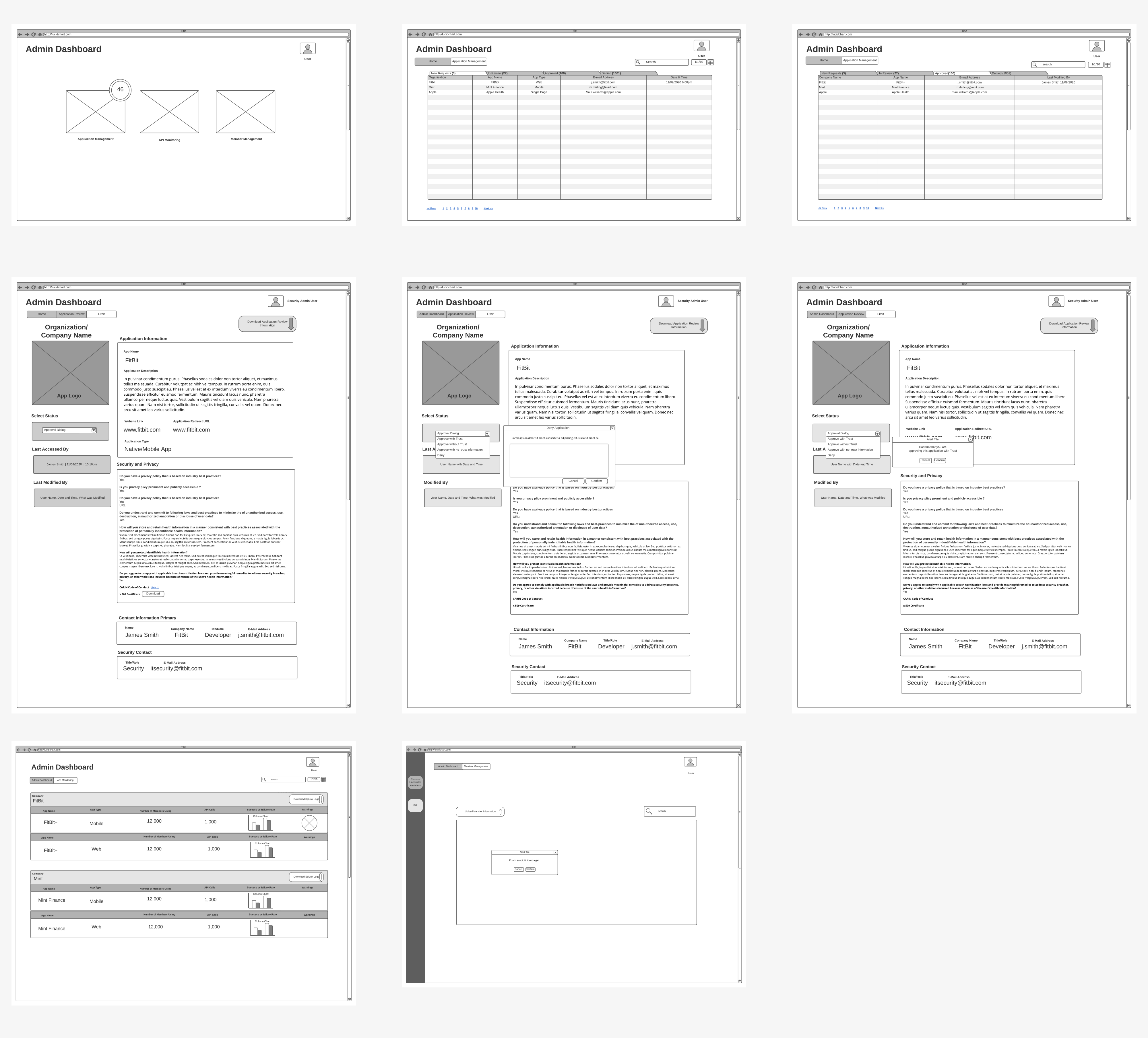
I was responsible for this project from start to finish. This included doing research, defining personas, creating flowcharts, usability test and wireframes as well as designing a finished user interface.

I do co-ordinated with developers on day to day basis to make sure the developed version is up to the mark and replica of my design.
After we defined the flow and thus what screens we needed I proceeded with creating the wireframes with help of my colleague to explore the experience in more detail on a screen-by-screen level. The main focus was successfully registration of an app which sits at the heart among the 3 portals.
Developer Portal Wireframe
Next I moved to exploring the overall look of the app. The out come was so different compare to our wireframes, I made sure the experience to get a user starts to register an app I have design a seamless homepage with information developers will look first, later I made sure the forms doesn't look tedious I have added the Illustration on each page which stole the show of this apps :-) and was very well appreciated by clients as well!
Visual exploration
Thanks to the PM's, they nailed each question we have asked in our lean UX process which gave us more guidance to help create wireframes after we defined the flow and thus what screens we needed I proceeded with creating the wireframes with help of my colleague to explore the experience in more detail on a screen-by-screen level.
Admin portal wireframe
Always thinking of a users first, I have designed modern look and feel for this application where the task for admin is so flawless which we noticed in our usability test with some admin user, where some of user's stated "we have never seen such kind of design well maintained spacing, typography and color's they loved the approach of each component behaviour
Visual exploration
This is a 3rd party application where I have to design one page which the members will see info of an application they want to get access or remove access for any app.
Member Portal